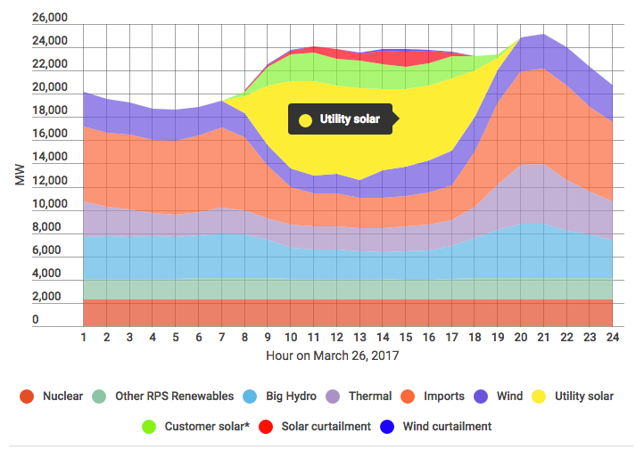
The information age has buried us all in information. So how do you get through to people who don't have time to read reports, journal articles, or even blog posts?
Data visualizations.
Putting data together in an interactive and visually compelling way can be the fastest way to get your point across, and a good way to get your busy audience to pause and digest your research.
And nothing is better suited to the "viz" treatment than the massive annual reports compiled by researchers in the Electricity Markets & Policy Group at Lawrence Berkeley National Lab.
For their annual reports on wind technologies and utility-scale solar, PaulosAnalysis developed a series of data visualizations using Tableau. While the software is a bit temperamental and dated, it is also quite powerful.
Below is one example, and more can be found here. The one below illustrates the drivers behind changes in wholesale power market prices.
I've also used Infogram to make simpler (but better looking) vizzes for Greentech Media.
Feel free to contact me if you have data that you'd like others to know about.
<a href='https://emp.lbl.gov/publications/impact-wind-solar-and-other-factors'><img alt=' ' src='https://public.tableau.com/static/images/Pr/Pricedrivers2008-222tabs/Story1/1_rss.png' style='border: none' /></a>
<script type="text/javascript">var divElement = document.getElementById('viz1575608474446'); var vizElement = divElement.getElementsByTagName('object')[0]; vizElement.style.height = '950px'; var scriptElement = document.createElement('script'); scriptElement.src = 'https://public.tableau.com/javascripts/api/viz_v1.js'; vizElement.parentNode.insertBefore(scriptElement, vizElement);</script>
